Image of the Week: Organizing = Data Science
May 16, 2021Organizing = Data Science
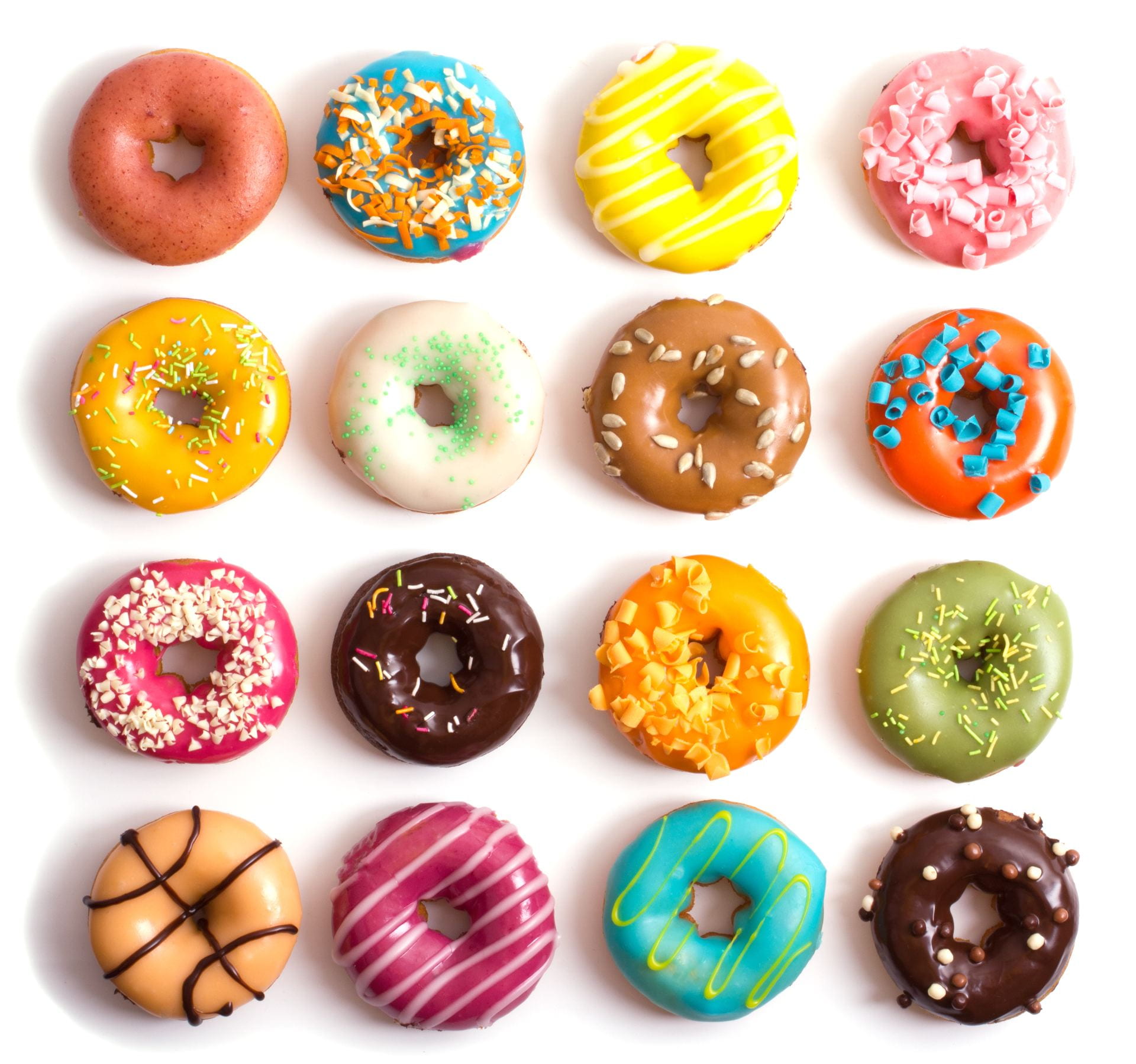
Have a look at this week’s image. How could you organize these doughnuts? Look closely. What do you see that could guide your organization?
In last week’s image, we focused on noticing attributes in a collection of objects: buttons. Noticing attributes opens the door to thinking about what different objects have in common and how they differ. Sorting objects by attributes, by making groups or ordering, is a form of mathematical organizing that begins before students even enter school. We often don’t think of organizing as a mathematical practice, but it is the heart of data science. A data set is simply a collection of data points – whether they are people, countries, objects, animals, or days – each with a set of attributes. By organizing the data along different attributes, we can compare groups, notice patterns, pose questions, and, possibly, make predictions.
And it can all begin with organizing doughnuts.
What did you notice about these doughnuts that could help you organize them? You may have thought to create groups in some of the following ways:
- By icing color: Pinks, oranges, yellows, greens, blues, browns, and whites
- By topping color: Mixed, pink, orange, yellow, green, blue, brown, white, and none
- Chocolate or not chocolate
- Stripes and no stripes
- Sprinkles and no sprinkles
- By toppings: Sprinkles, striped icing, curled chocolate shavings, seeds, coconut, or none
Noticing these attributes is just the beginning. Point out that organizing can help us answer questions. Ask, What question could you answer if you organized the doughnuts in these ways? You might answer questions like:
- What is the most common doughnut color? What is the least common?
- What are the most common toppings?
- Do more doughnuts have chocolate on top or not?
- Do more doughnuts have stripes or not?
- And then the biggest data question: What does a typical doughnut look like?
To answer these or any other questions, students then need to figure out how to organize. One of the reasons we love introducing data science through objects and images is that these can be sorted physically. Students could simply put these in clustered groups, but they might invent other early data displays. Consider how this representation look like graphs we’re more familiar with:

These data displays can inspire intriguing observations and new questions. When students share their representations, invite the class to notice patterns, trends, contrasts, and similarities and pose questions about the data. It’s worth engaging students in organizing activities repeatedly all across the elementary grades to develop students’ intuition about data in all its forms well before statistics are introduced.
Are you back in-person? Consider printing out the pdf version of this activity so that students can cut out the doughnuts and glue or tape them down in different sorted representations.
And we invite you to follow us on Twitter! Tweet us the fascinating ideas you students have about our activities or how you’re trying these activities in your space. We can’t wait to hear from you!
To multiplicity, cheers!
Jen Munson and the multiplicity lab group
Read the Archive
Get the Image of the Week
Each week we bring you a new image and activity you can do with your students tomorrow, and we spotlight a feature of the mathematical work that we think is important for students’ learning and your teaching.
Stay connected and see what's new.

